How to Promote a Loyalty Program: QR Signs, Sizes & Posts
How to get your first 30 customers onto a loyalty card: where to put the QR code, how big to print it, what the sign should say, and what to post.
Key Takeaway: To promote a loyalty program, put a QR sign wherever customers wait with their phone in hand, make the code one tenth as wide as the distance they will scan from, write the reward on the sign, and have staff ask every customer at checkout for the first two weeks. Three posts for the people who already follow you cover the rest.
FaveCard Team
Published September 24, 2026 · Updated September 24, 2026
Last updated: September 2026
A new loyalty card has one job in its first weeks: getting people onto it. The design and the software matter less than one question: does the customer at your counter today leave with the card on their phone? This guide covers the launch week that does it: the reward you promise, the QR sign and how big to print it, where it goes, what it says, what staff say out loud, and three posts for Instagram.
The short answer:
- Pick a reward people can reach in about eight weeks. Longer cards rarely get finished.
- Print one QR sign per spot where customers wait: register, table, chair, window. Size the QR code at one tenth of the scanning distance, and never under 2 cm (0.8 in).
- Write the reward and the visit count on the sign, plus “no app needed”. Never just “scan me”.
- Ask every customer at the moment they pay. One sentence from staff beats any poster.
- Post three times in the first two weeks: the announcement, how to join, the first reward.
Most of this works whatever loyalty software you use. The last section shows how to make the sign and the posts in FaveCard, including what is free and what is not.
Before you print anything: a reward people can actually reach
Promotion only works if the card is worth joining, and the most common reason a card is not is that the reward is too far away. In our study of 23,296 loyalty stamps across 1,013 small businesses, cards designed to be completed in 2 to 4 weeks were finished 11.4% of the time. Past eight weeks, completion fell to about 4%, and past 16 weeks to under 2%. So before you design a sign, do the sum: how often does a typical regular visit, and how many stamps does your card need?
- A café regular who comes three times a week reaches 10 stamps in under four weeks. That is a good card.
- A salon client who comes every six weeks needs a year to reach 10 stamps. That card will not get finished. Five stamps, or a reward every third visit, is closer to right.
The completion rate benchmark has a calculator for this. The reward itself should be something you would be glad to hand over: the product people already buy, not a discount on something they don’t.
How big should a QR code be when printed?
Make the code one tenth as wide as the distance it will be scanned from, and never smaller than 2 × 2 cm (0.8 × 0.8 in). A code on the card reader, scanned from about 30 cm (1 ft), can be 3 cm (1.2 in) wide. A counter card read from half a meter needs 5 cm (2 in). A sign in the window, read from 2 meters (6.5 ft), needs a code about 20 cm (8 in) wide.
That is the common “10:1 rule”. QR code generators such as QR Code Generator put it as “the scanning distance is about 10x the QR Code size”, with 2 × 2 cm as the minimum. Nobody publishes where the rule comes from, so we checked it.
How we tested it. We ran a simulation, not a phone test. We took the QR codes FaveCard’s print editor actually produces, at 8 sizes from 1.5 to 12 cm plus the editor’s own label, A6 and A4 layouts. For each size and distance, we rendered 20 synthetic camera frames at 1920 × 1080, the resolution Google’s ML Kit guidance recommends for scanning from a distance, with realistic blur, noise, compression and tilt. Four open-source QR decoders then tried to read each frame. A distance counted as “reliable” when a decoder read the code in at least 90% of frames.
What we found:
- The 10:1 rule holds, with a little margin. Measured on the whole printed code, white border included, codes without a logo read reliably out to about 10 to 13 times their width.
- A logo in the middle costs range. A center logo forces a denser code with more error correction. In our runs, that cut the reliable distance by roughly 12 to 18%.
- Angle matters less than size. Reading the code at 35° from straight on cost between 5 and 23%, depending on the decoder.
| Where the QR goes | Scanned from | Minimum QR width | FaveCard format that fits |
|---|---|---|---|
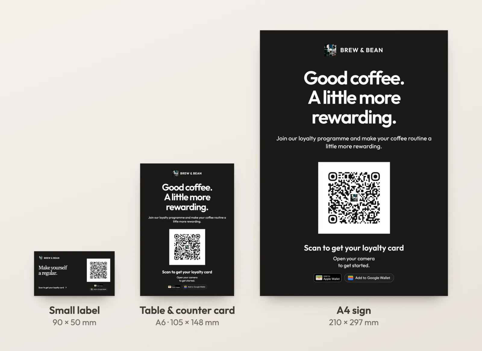
| On the card reader or register | 20–30 cm (8–12 in) | 2–3 cm (0.8–1.2 in) | 90 × 50 mm label (26 mm code, reliable to about 20–25 cm in our simulation) |
| On the counter or table | 30–50 cm (1–1.5 ft) | 3–5 cm (1.2–2 in) | A6 counter card, about 4 × 6 in (40 mm code, about 35–40 cm) |
| On a wall or door, up close | 50 cm–1 m (1.5–3 ft) | 5–10 cm (2–4 in) | A4 sign, close to US Letter (80 mm code, about 65–80 cm) |
| In the window, from the sidewalk | 2 m (6.5 ft) or more | 20 cm (8 in) or more | A bigger poster, using the QR image in your own artwork |
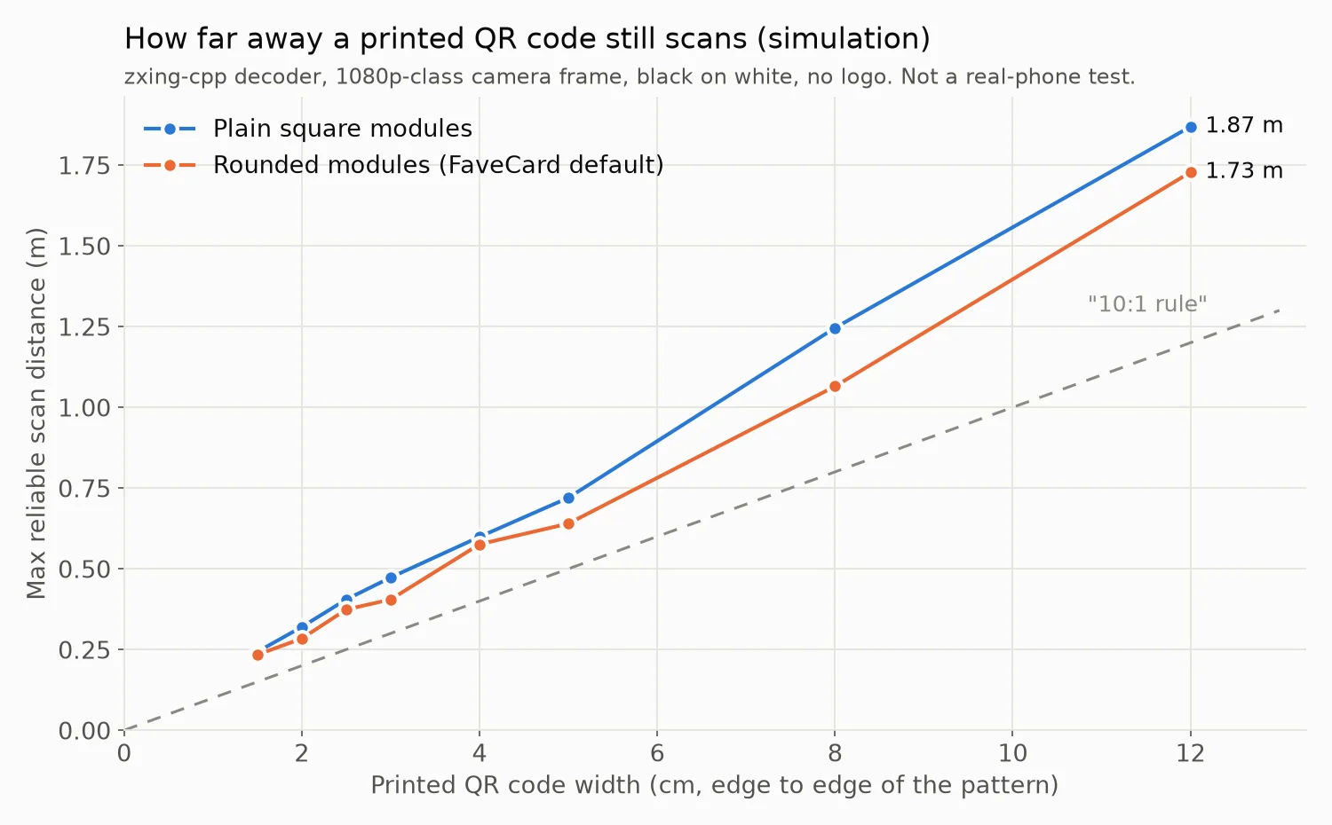
Simulation, not a real-phone test. A phone’s own camera app uses autofocus, several frames and its own detector, so real phones may do better than these numbers. Glare and lighting were not modeled. Treat the distances as planning guidance, not a guarantee.
The full size chart in cm and inches, what a logo and tilt cost, and how the test worked are in How big should a QR code be? We tested 8 sizes.
Where to put the QR code in your shop
The best spot is where the customer stands still with their phone already in hand. That is almost never the front door.
| Spot | Who sees it | Good format |
|---|---|---|
| Next to the card reader or register | Every paying customer, at the moment they pay | Counter card (A6) on a stand, or a label on the reader |
| On the table | Seated customers with time to kill | Counter card or table tent |
| At the chair or station (barber, salon, nails) | Clients during the appointment, in the mirror | Label on the mirror frame or station |
| In the window | People walking past, before they are customers | A4 sign, QR at chest height |
| On the bag, box or receipt | Takeout customers, after they leave | Label or sticker |
A few rules that apply everywhere:
- Chest to eye height. A QR code at knee level on the front of a counter does not get scanned. Neither does one the customer has to lean over the counter to reach.
- Watch the glare. Laminated and glossy prints reflect spotlights straight into the camera. Matte paper, or a matte laminate, avoids it.
- One code per spot, not three. A sign with a loyalty QR, a Wi-Fi QR and a menu QR next to each other makes the customer choose. Give the loyalty code its own sign.
- Put it where the waiting happens. The register, the table and the chair all come with a minute of dead time. The door comes with none.
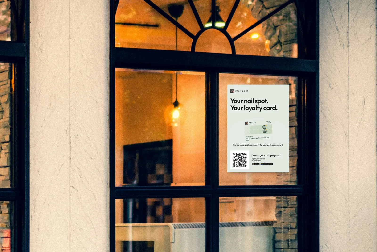
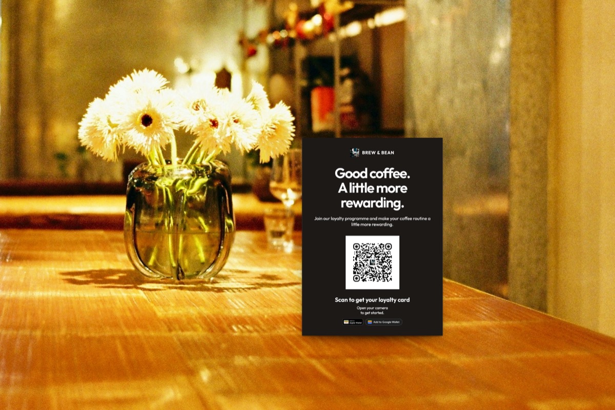
Illustration: a real A4 export from the FaveCard print editor, placed in a stock photo of a shop window.
What to write on a loyalty program sign
The sign has to answer the customer’s three questions in the second they look at it: what do I get, how long does it take, and how much hassle is it. “Scan me” answers none of them.
The formula: reward + number of visits + “scan to join, no app needed”.
| Business | Headline | Line under the QR |
|---|---|---|
| Café | Every 10th coffee is on us | Scan to add your card to your phone. No app needed. |
| Barbershop | Your 6th cut is free | Scan now, get your first stamp today. |
| Nail salon | Every 5th manicure, 50% off | Scan to join. Your card lives in your phone’s wallet. |
| Bakery | Buy 9 loaves, the 10th is ours | Scan to start collecting. No app, no paper card. |
Things to leave off the sign:
- The terms and conditions. The card itself can carry them.
- Your full website address. Nobody types it.
- More than one call to action. “Follow us, review us, join our card” means none of them happens.
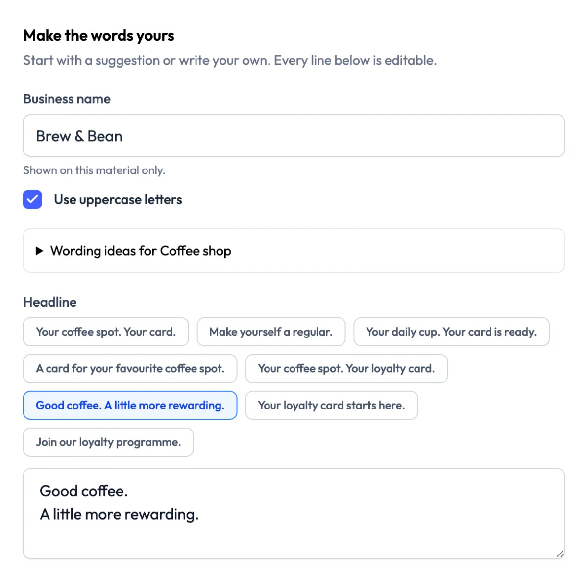
The print editor suggests wording for your trade. Every line is editable, so put your reward in the headline.
Color or black and white?
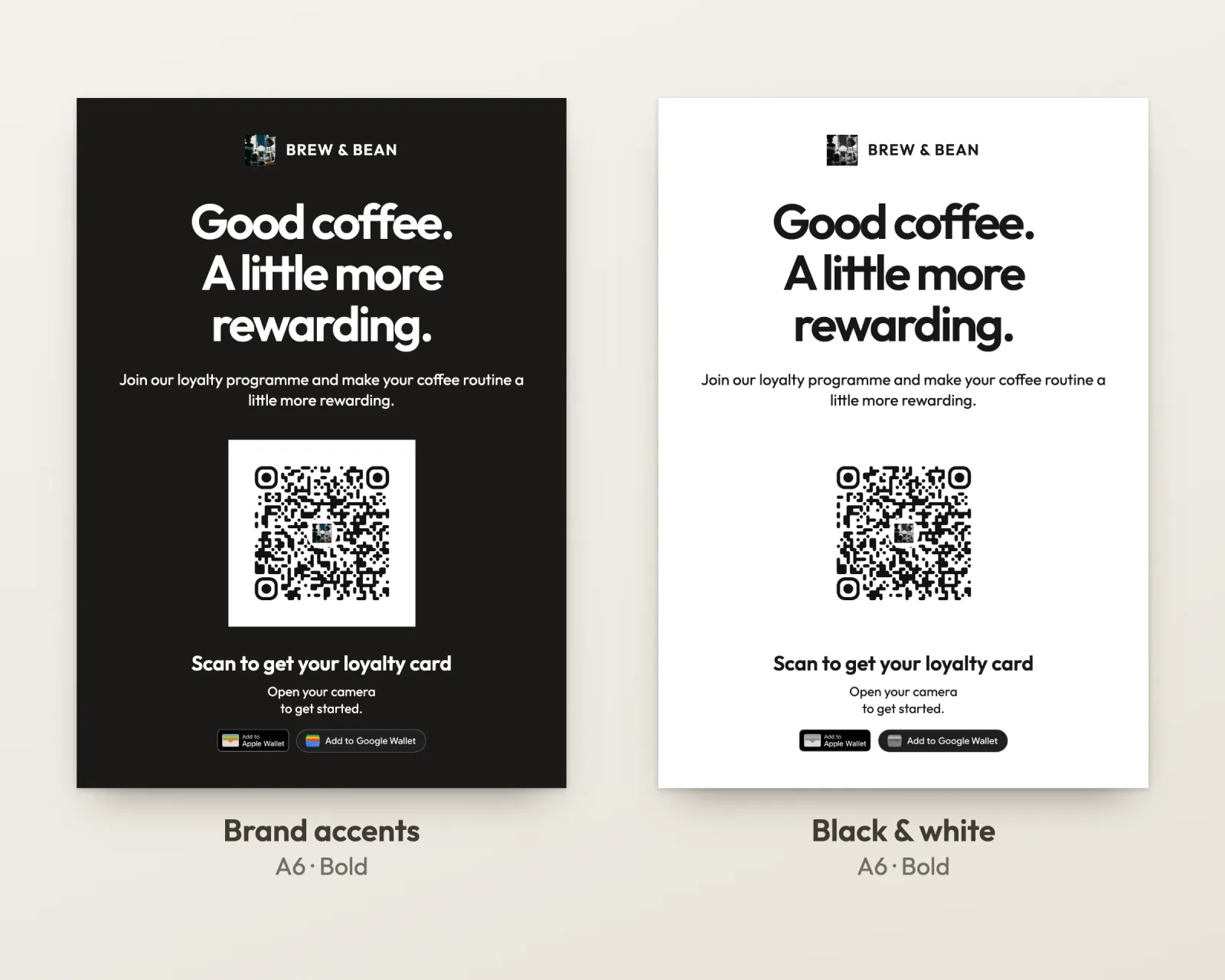
Keep the QR code itself dark on white, whatever color the rest of the sign is. The design around it can use your brand colors, but the code needs strong contrast between its dark squares and a light background.
- Put a white panel behind the code on dark or colorful designs, and leave a clear white margin around it. The QR standard itself asks for a quiet zone four modules wide on every side, according to Denso Wave, the company that invented the QR code.
- Black and white is fine. On an office printer it saves color ink, and the code loses nothing. A dark design printed in color and the same design in black and white carry exactly the same QR.
- Avoid pale codes. A light grey or pastel code on white might look elegant, but it leaves the camera with little contrast to work with. Our simulation did not model lighting or glare, so we can’t put a number on it, and that is exactly why black on white is the safe choice.
Say it out loud: the one sentence that fills the card
Signs do the remembering; people do the asking. In practice, people join when someone asks them, and the moment that works is when they pay, because the phone is already out.
Give staff one sentence and ask them to use it with every customer for the first two weeks:
Do you want our loyalty card? It’s one scan, it goes in your phone, and your [10th coffee] is free.
Then stamp the first visit straight away. A card that already has one stamp on it feels started, not empty.
It is worth the awkwardness. Toast’s report on restaurant regulars, covered by CX Dive, found that guests who sign up for a restaurant’s loyalty program return at nearly 30%, against a 7% baseline. The same report found that about half of diners say being recognized by staff is what makes them feel valued most.
If staff keep forgetting, take them out of the loop: a tablet on the counter in kiosk mode lets customers join and collect their own stamp by scanning a code on the screen.
What to post on Instagram to launch it
Your followers already like you, which makes them the easiest first 30 customers you will get. Three posts over the first two weeks are enough:
- The announcement. The card itself, the reward and the date it starts. “Our loyalty card is here. Every 10th coffee is on us, starting today. It lives in your phone, no app needed. Link in bio.”
- How to join. A graphic with the QR code and three steps: scan, add to your phone, get a stamp at the register. Post it as a story too, with a link sticker, because links in captions are not clickable.
- The first reward. When the first customer earns a free coffee, thank them (with their permission) or simply show the full card. It proves the reward is real.
A few format notes:
- Use 4:5 portrait (1080 × 1350 or larger). It is the tallest feed shape Instagram supports for photos, so the card and the QR get the most screen.
- Keep text away from the side edges. The profile grid shows a narrower, taller thumbnail than the feed, so a headline that runs to the sides can get cut there.
- Make the QR scannable from another screen. People do scan a code off a friend’s phone or a laptop, so give it room and dark-on-light contrast, same as on paper.
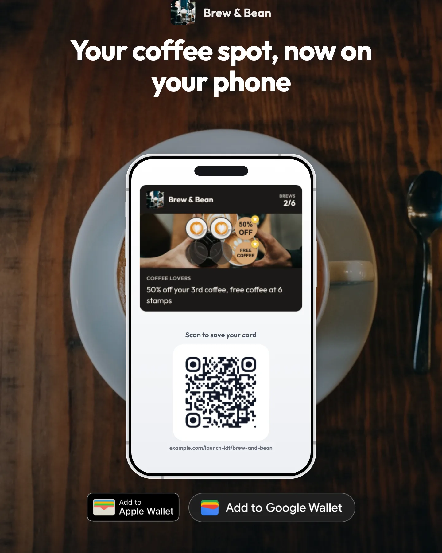
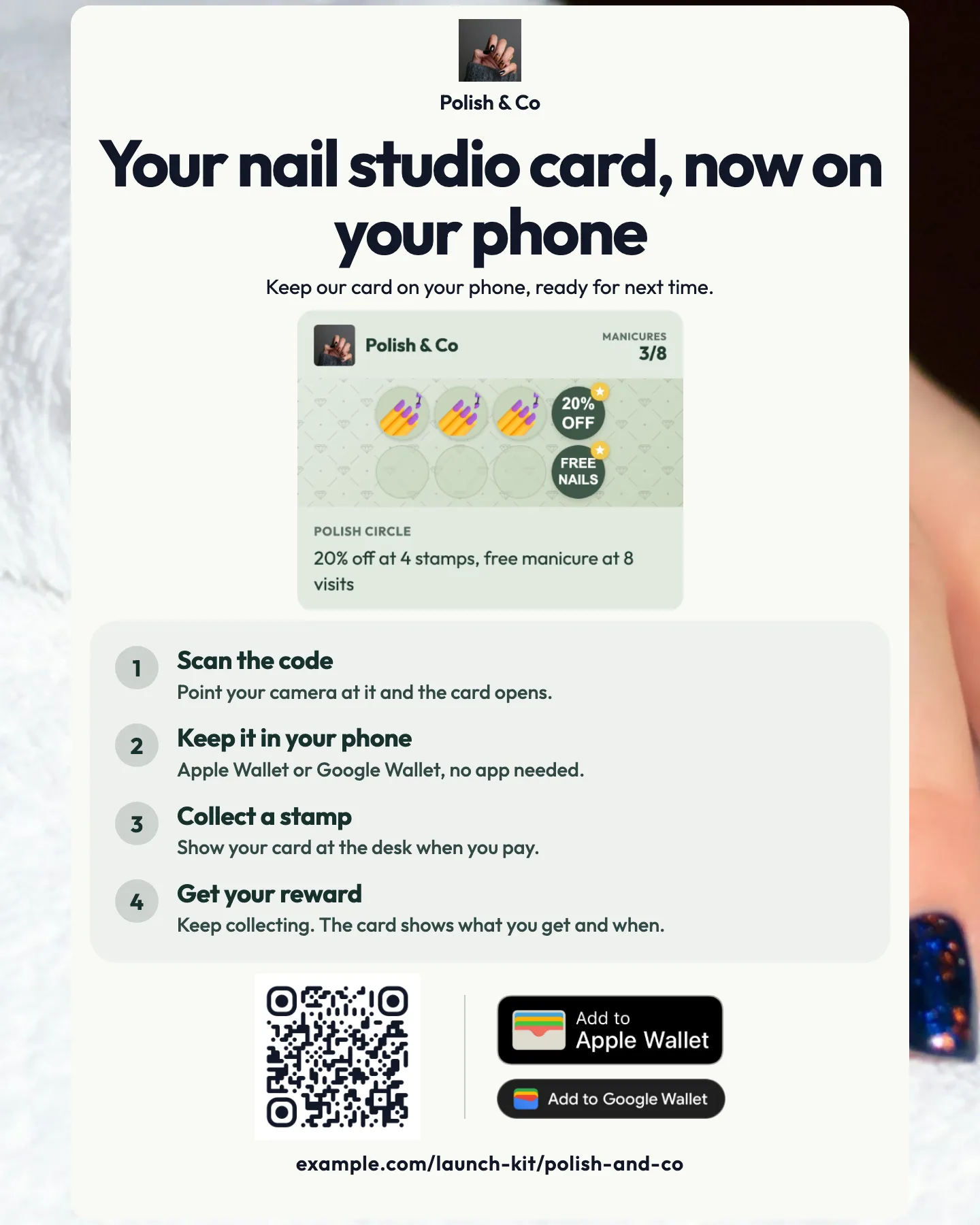
An announcement post and a how-to-join graphic, both exported from the FaveCard social graphics editor in the post format (4:5).
What not to do
- Don’t give stamps for Google reviews. Google’s contribution policy lists as prohibited: “Offer incentives – such as payment, discounts, free goods and/or services - in exchange for posting any review”. Ask for reviews, make it easy with a review link, but keep them separate from the card.
- Don’t make people download an app to join. Every extra step at the counter loses people. A card that goes straight into Apple or Google Wallet, or opens in the browser, takes one scan.
- Don’t launch and go quiet. The first two weeks decide whether regulars get into the habit. Ask every customer, every time, until the card is on most of your regulars’ phones.
How to make the sign and the posts in FaveCard
FaveCard builds the sign and the posts from the card you already made, so the logo, colors and QR code match without a designer.
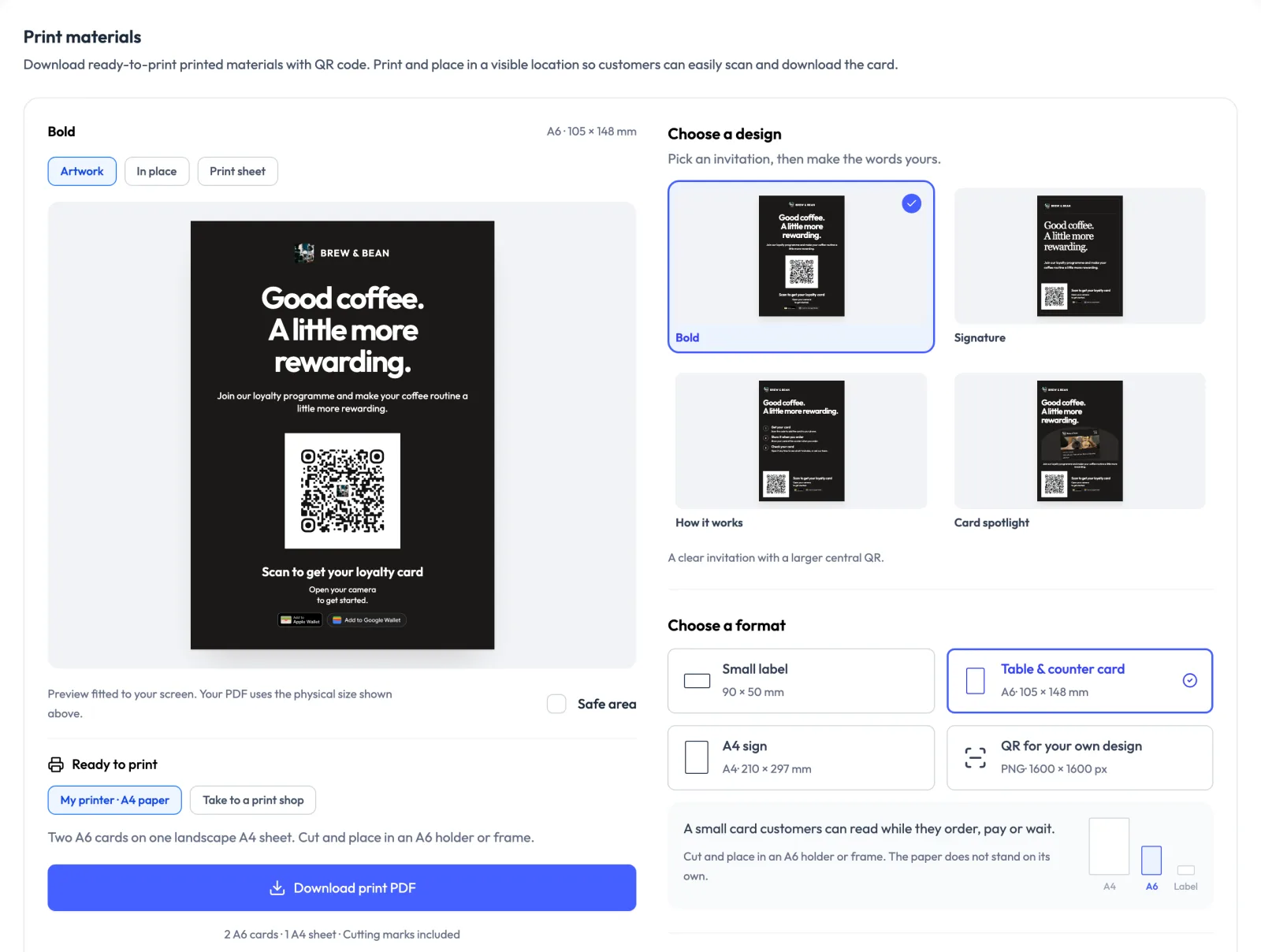
Print materials. In the sharing section of your card or your Business Page, the print editor offers four designs (Bold, Signature, How it works and Card spotlight) and four formats: a 90 × 50 mm label, an A6 table and counter card, an A4 sign, and a 1600 × 1600 px QR image for artwork you design yourself in Canva or Word. It suggests wording for your trade, and every line stays editable. You can download a PDF for your own printer (two A6 cards or ten labels on one A4 sheet, with cutting marks) or a single-size file for a print shop, in color or in black and white.
Social graphics. The same card becomes an Instagram post (4:5), a square post or a story, plus a how-to-join graphic with the three steps and the QR code, in your card’s colors.
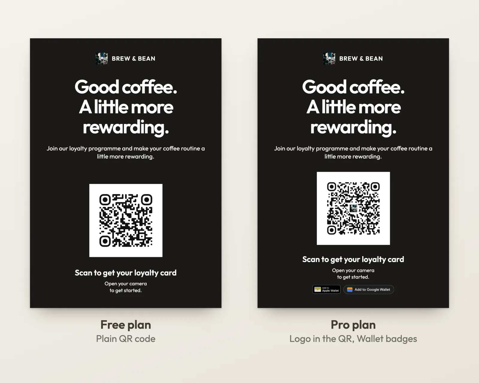
What it costs. The print editor and the social graphics are on every plan, including Free. Two extras on card materials need Pro, or the free trial that runs until your first 30 customers: your logo in the middle of the card’s QR code, and the “Add to Apple Wallet” and “Add to Google Wallet” badges, because Wallet passes are a Pro feature. Materials for your Business Page can carry your logo in the QR on every plan. On Free, customers get a card that opens in the phone’s browser. See pricing for the full list.
If you don’t have a card yet, you can create one in about five minutes and come back to print it.
Keep going after the first 30
Once your regulars have the card, the job changes from getting people on to bringing them back: a slow-day offer, a birthday reward, a nudge for someone who has not been in for a while. Our list of loyalty card promotion ideas picks up from there, and the signup questions guide covers what to ask people when they join.
Frequently Asked Questions
How do I get customers to sign up for my loyalty program?
Ask every customer, at the moment they pay, and make joining take one scan. Put a QR sign where the customer is already looking while they wait: the counter, the card reader, the mirror at the chair. Say the reward and the number of visits on the sign, not just "scan me". Give staff a one-line script too: a sign reminds people, but asking is what turns a customer into a member.
How big should a QR code be on a printed sign?
Divide the distance the customer will scan from by 10. That gives the minimum width of the QR code, white border included: about 3 cm (1.2 in) for a code on the card reader, 5 cm (2 in) for a counter card read from half a meter, 20 cm (8 in) for a window sign read from 2 meters (6.5 ft). Never go below 2 × 2 cm (0.8 in). A logo in the middle of the code shortens the range, so size up a little if you use one.
Where should I put the QR code for my loyalty card?
Where the customer stands still with their phone already in hand: next to the card reader or register, on the table, at the salon or barber chair, and in the window for people walking past. Keep it at chest to eye height, away from glare, and never somewhere the customer has to lean over the counter to reach.
What should a loyalty program sign say?
Three things: what they get, how many visits it takes, and that joining is a scan with no app. For example: "Every 10th coffee is on us. Scan to add your card to your phone, no app needed." Leave out the terms and conditions; the card itself can carry those.
Can I give a loyalty stamp for a Google review?
No. Google's contribution policy forbids offering incentives such as discounts or free goods and services in exchange for a review. You can ask for a review, and you can make leaving one easy, but it cannot earn a stamp or a reward.
What should I post on Instagram to launch a loyalty card?
Three posts over the first two weeks: an announcement that shows the card and the reward, a how-to-join graphic with the QR code and three steps, and a thank-you when the first customer earns their reward. Use the 4:5 portrait format so the post fills the feed, and put the join link in your bio and in a story link sticker, because links in captions are not clickable.